
Case study

Landing page design for a bold, woman-owned film studio turning wild ideas into unforgettable stories on screen

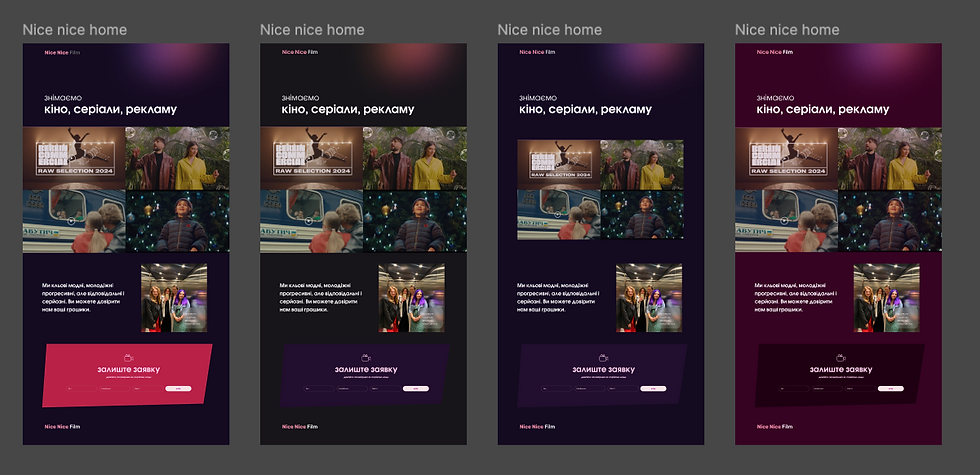

Context
This website was designed for my friend’s woman-owned film production studio, where most of the leadership team are also women. They’re a young, ambitious crew already taking on exciting projects, so my goal was to create a site that reflects their energy, creativity, and spirit — bold, fresh, and unapologetically cinematic.
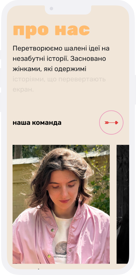
Visuals
For the visuals, I mixed hand-drawn illustrations, soft gradients, and bold typography to give the landing page a unique character. The illustrations add a playful, human touch; the gradients bring in depth and mood; and the strong fonts anchor everything with confidence. Together, they showcase the studio’s spirit — creative, young, and unafraid to stand out.

Font
Rubik One
Rubik One Bold
Rubik Regular
Colors
#F1E6D9
#FFBB6D
#CE9BB2
#2C1E21

#D32576
#FFA681
#696969
Final thoughts
This turned out to be one of my favorite projects ever — fun, inspiring, and full of personality. It was a real joy to capture the team’s energy in a visual identity that feels true to their spirit.


