
Core insights for the full IT Lifecycle SaaS platform
A three-year collaboration shaping Velory’s SaaS product into a scalable, user-driven platform.
Role: Product Designer •
Client: Velory • Time period: 3.8 years


Context
Current situation
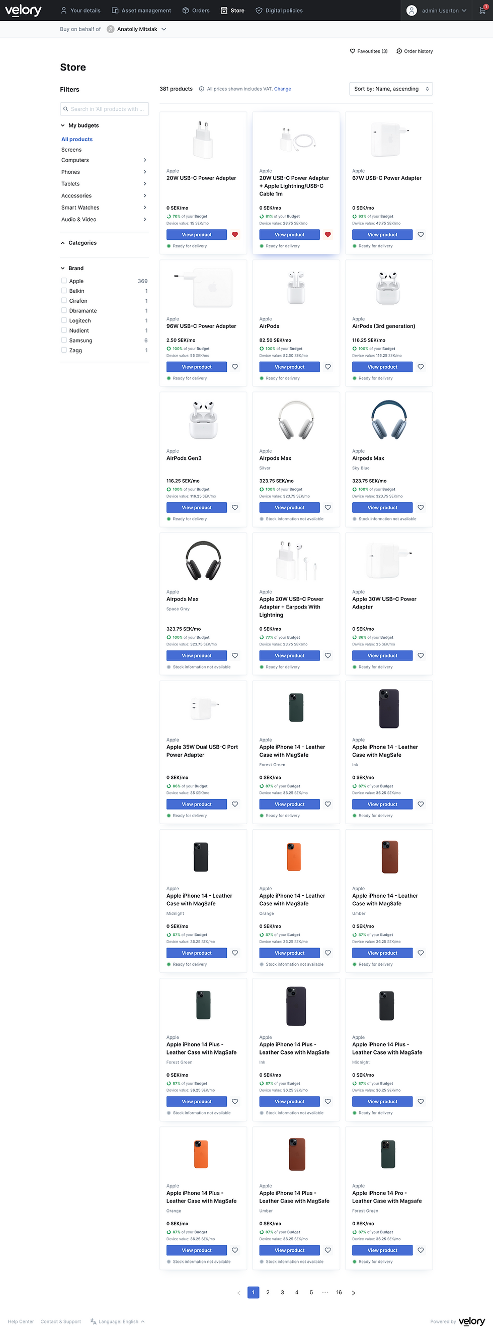
When I just joined Velory had a lot of features developed with the old design but wanted to rebrand to better reflect its mission.
Critical issues
Velory faced some critical challenges: the old design didn’t reflect the brand identity well and didn’t effectively support sales. Additionally, implementing new pages was very slow, forcing us to roll out updates incrementally, bit by bit.
Business goals
Velory’s goal was to create a strong, clear brand identity that reshapes how the market perceives the company and drives increased sales.

Some Velory pages when I just joined
Approach
Interviewing current users
When I just joined Velory had a lot of features developed with the old design but wanted to rebrand to better reflect its mission.
Building CJMs and Old flows
Velory faced some critical challenges: the old design didn’t reflect the brand identity well and didn’t effectively support sales. Additionally, implementing new pages was very slow, forcing us to roll out updates incrementally, bit by bit.

Some Velory pages when I just joined


First design suggestions
Early design concepts were also explorations with an attempt to find a balance between visuals and function.
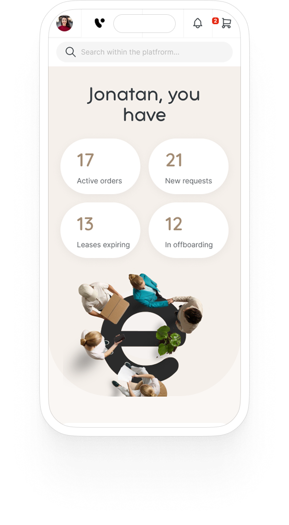
Core task for the dashboard: managing widgets that show data from different parts of the platform


A lot of them worked!
And with a step-by step iteration we started to implement this style across the product. Testing and testing and testing each page internally with users
💡 Big challenge for us was facing existing users which we had to slowly convince and transition to our new design environment.


Mobile challenges
Making the dashboard widgets fully responsive turned out to be one of our biggest mobile challenges.
Some widgets relied on complex layouts that worked well on desktop but didn’t translate neatly to smaller screens. We had to rethink their structure, condense content, and find ways to keep them functional and easy to read without losing important details.


Social media & Marketing
I created a set of social media and marketing graphics that extended Velory’s brand beyond the product. By using the same color palette, typography, and visual motifs, these assets kept the brand instantly recognizable across campaigns — from LinkedIn posts to promotional banners — while adapting the tone for different audiences and platforms.


Outcome
Increased usability and great user feedback
The redesign helped Velory establish a cohesive and compelling brand identity, improving market perception and driving a notable increase in sales. Streamlined features and faster rollout boosted user engagement and product adoption.
Both Stakeholder and internal feedback
Velory’s new brand identity and UI updates supported growth in conversion rate, positively impacting monthly recurring revenue. The new design system development cycle times increasingly improving product agility.