
Turning complexity into
simple experience
Shaping Velory’s SaaS full IT lifecycle product into a scalable, user-driven platform.
Role: Product Designer • Client: Velory • Time period: 3.8 years


Some Velory pages when I just joined
Problem statement
Overview
Velory is a B2B SaaS platform that helps organizations manage the full lifecycle of their IT devices — from procurement and deployment to returns and renewals.When I joined, the product had grown fast but lacked consistency across flows, making it hard for users to navigate complex processes intuitively.
Critical issues
As the platform expanded, UX debt accumulated.
The main challenges included:
• Fragmented design patterns and inconsistent UI across modules
• Complex multi-role user journeys (admins, employees, suppliers)
• Lack of unified data visualization and design governance
• Time-consuming handoffs between design and development
disconnect bewteen Velory branding and actual platform look and feel
Users felt overwhelmed. Teams struggled to iterate quickly and maintain quality.
Approach
I approached the redesign through three key streams:
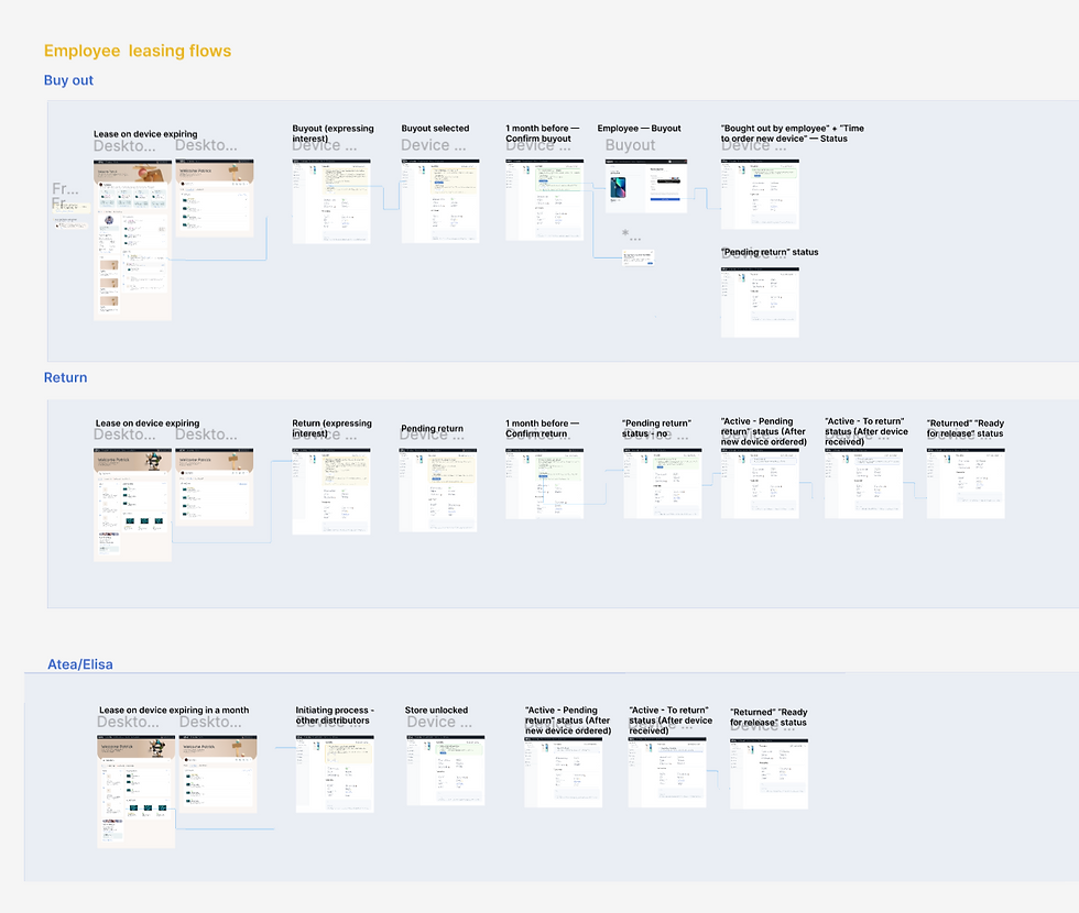
Reviewing Old flows
The goal was to identify friction points, redundancies, and opportunities for simplification across multiple user journeys.
Research & Insight
• Conducted user interviews with IT managers and procurement teams to identify pain points.
• Analyzed behavioral data (Mixpanel, Hotjar) to map friction points in core flows.
• Synthesized findings into journey maps that revealed disconnection between user goals and product structure.
Some Velory pages when I just joined


Iteration & Validation
• Introduced a RITE testing approach — rapid iterations during prototype testing.
• Collaborated closely with engineering to reduce design–dev cycle times by 30–40%.
• Used AI-assisted workflows (Figma Make, ChatGPT, Perplexity) for research synthesis, copy exploration, and prototype annotation.
Started from implementing new design components incrementally, step-by-step into the existing design flows.
Structure & Systems
Key step for improving the design processes was building a scalable, easy to maintain design system. For that we decided to built a modular design system in Figma, based on atomic design principles.


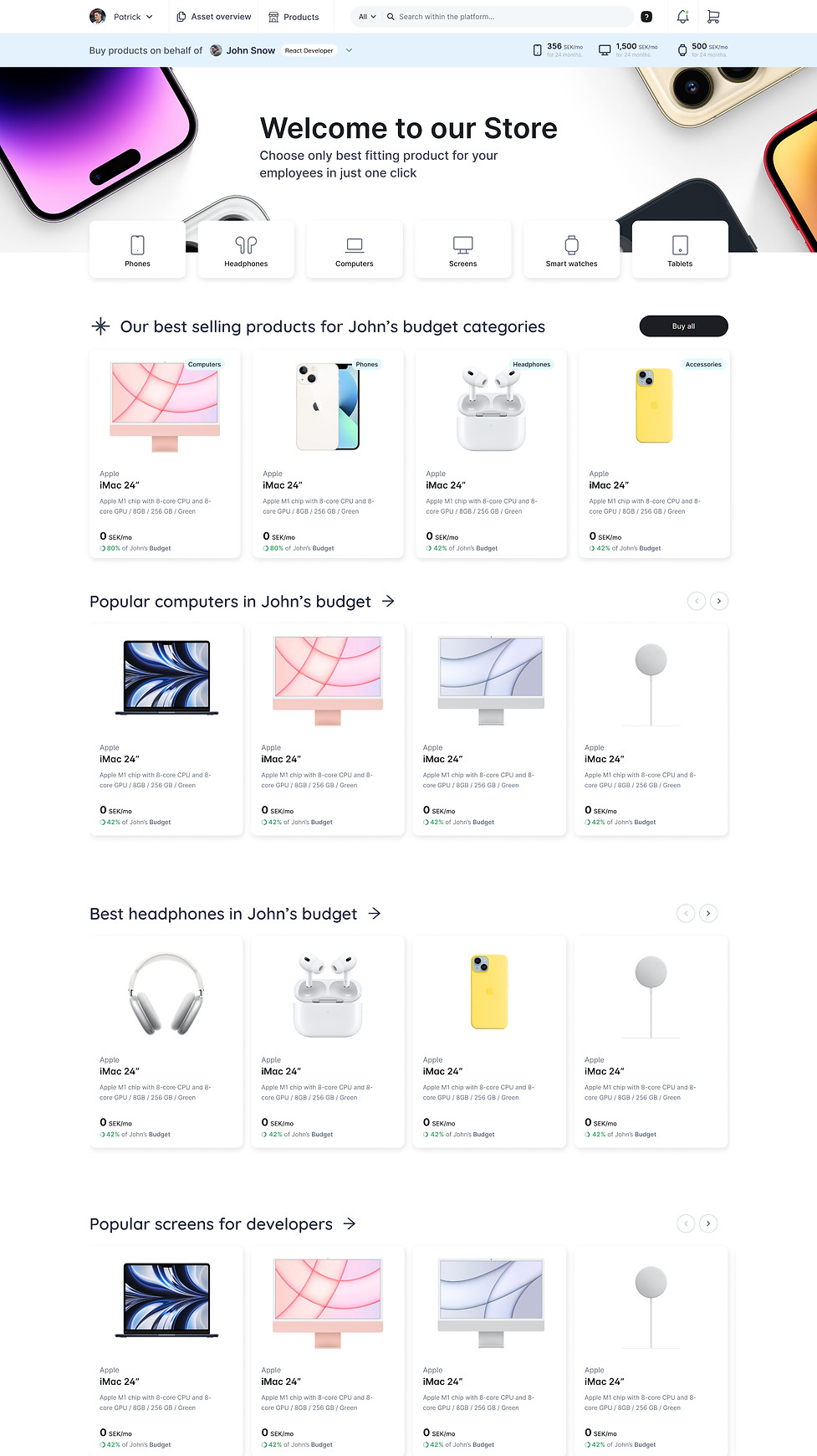
Store design solutions
The main challenge in redesigning this e-commerce store was handling built-in budgets that change the prices users see and adding custom product suggestions.
The old design had problems with budget settings, filters, and quick suggestions that didn’t work well for users. These issues made it hard for users to find the right products and understand prices.
The redesign improved:
• how budgets affect prices,
• made filters easier to use
• added smarter product suggestions.
This helped create a smoother and more personalized shopping experience.
before
after
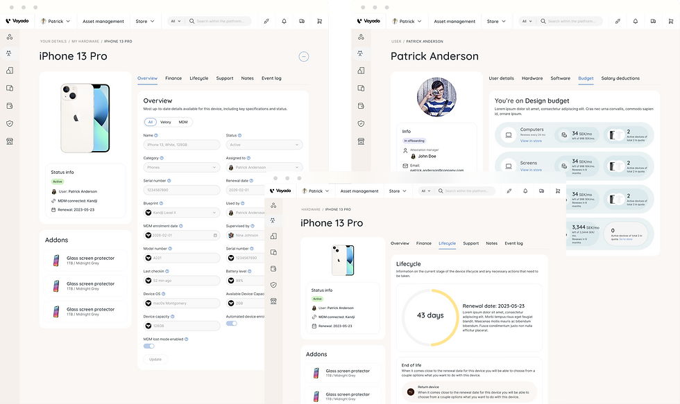
Asset management solutions
The asset management section faced significant complexity due to numerous tables, large amounts of data, and convoluted user flows that made navigation difficult for admins.
Keeping track of recent activity was also a challenge, as the old design did not effectively highlight the most relevant updates or changes.
The redesign focused on simplifying the interface by organizing data more clearly, streamlining workflows, and prominently displaying recent activity to help admins stay informed and work more efficiently.


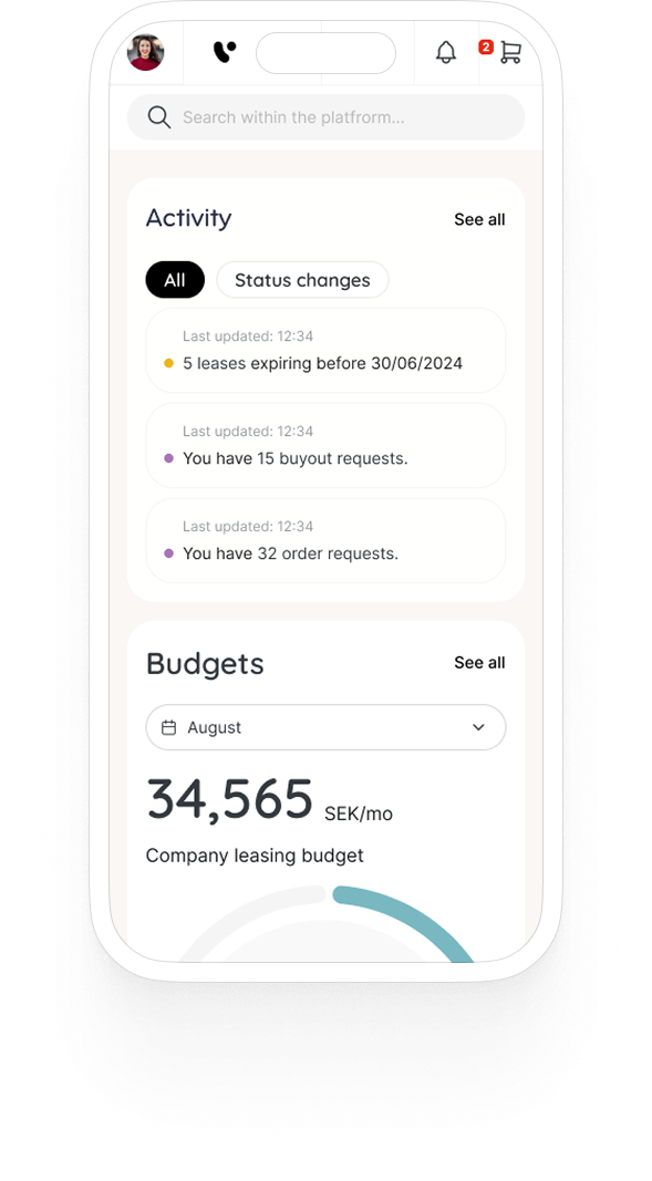
Mobile challenges
Making the dashboard widgets fully responsive turned out to be one of our biggest mobile challenges.
Some widgets relied on complex layouts that worked well on desktop but didn’t translate neatly to smaller screens. We had to rethink their structure, condense content, and find ways to keep them functional and easy to read without losing important details.


Outcome
The successful design outcome resulted in a cohesive and scalable platform.
-
By establishing a unified design system, fragmented patterns and inconsistent UI elements across modules were harmonised, ensuring visual and functional consistency.
-
design to dev handoff speed increased by 40%;
-
Multi-role user journeys were simplified through tailored, role-specific flows that improved task efficiency for admins and employees;
-
NPS score improved from 85 to 98 and overall customer satisfaction increased resulting in positive feedback across different channels